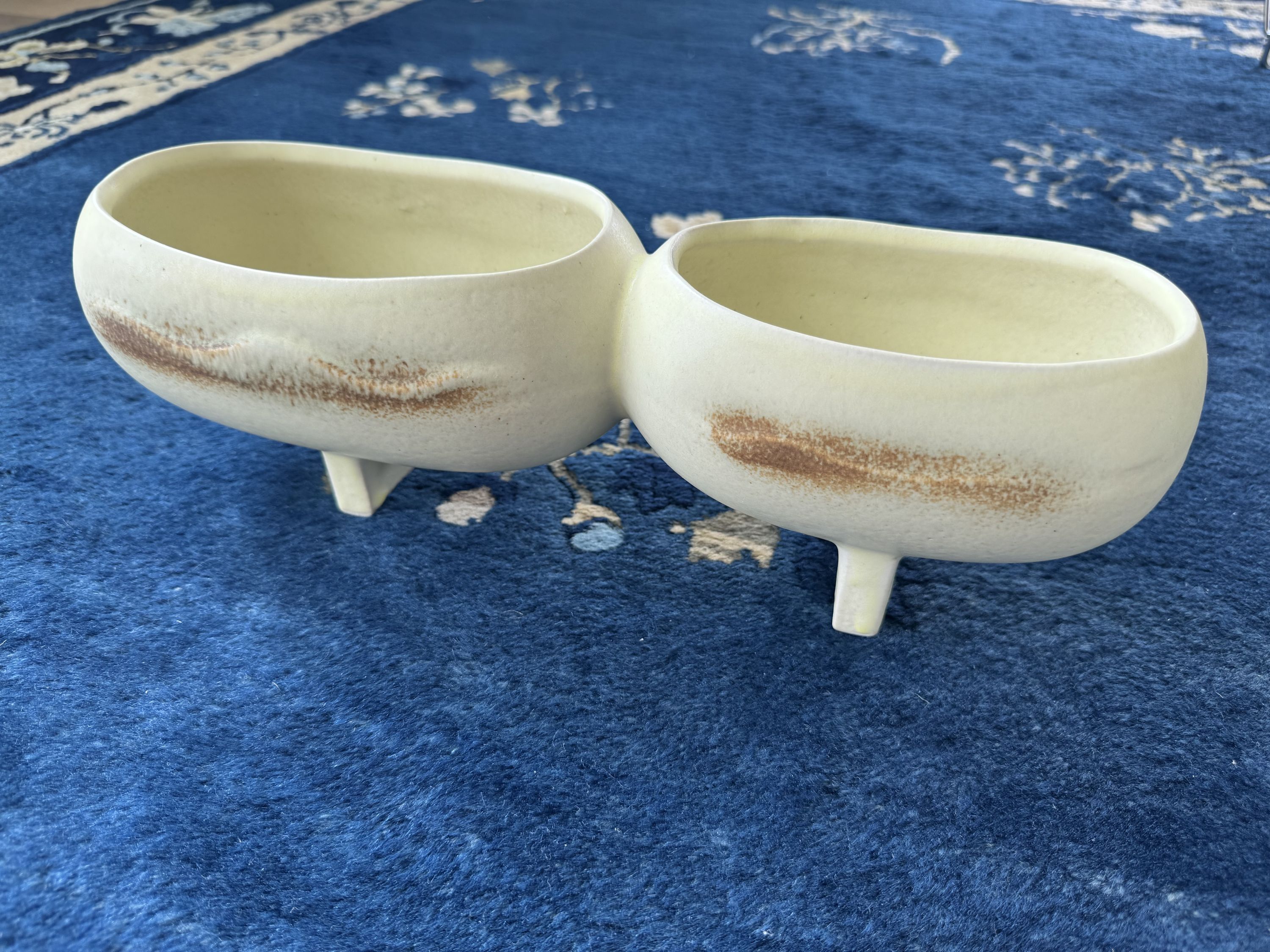
Yellow Ikebana Vase
May 4, 2025
This is another vase I got from Grizzly Tackle, referenced in this post: Alien Egg Vase.
This is one of my favorite vases because it reminds me of a cute caterpillar. I think subconsciously it reminds me of this guy in Yoshi’s Story, which was a core memory to me:
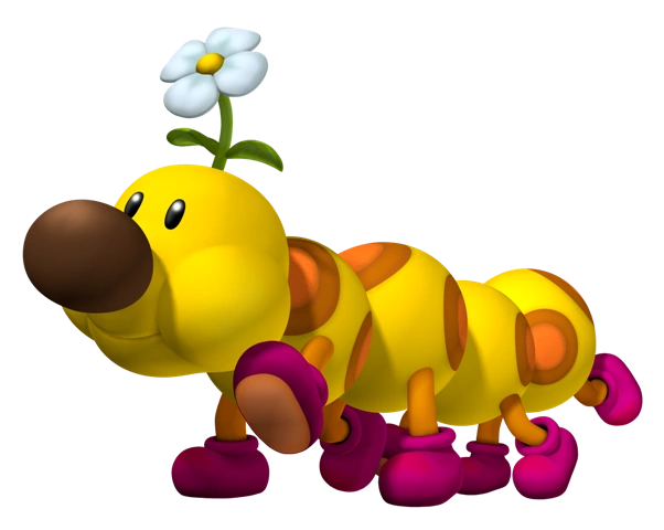
The color, the segmentation, and the slightly darker brown stripes feel reminiscent of the yellow, orange, and brown of the “Wiggler” from Yoshi’s Story.
Yoshi’s Story is one of the first video games I remember playing on my N64, and the backgrounds and music within the game felt really magical to me. This idea of referencing physical textures in a digital space felt really warm, inventive, and welcoming. Maybe because I was at the age where I still was making things with paper (though what I remember most were the quilted elements).
Choices in how materials were simulated effectively provided the visual language for the game through complementary textures, patterns, and shadows. Utilizing the inherent qualities of the source material as a design element always feels inventive and honest (honesty being something I reference in almost all of these posts… although I know it’s cognitively incongruent to say there’s honesty in these paper and upholstered objects just being 2D digital assets lol… but conceptual frameworks without flaws are super boring…)
It’s clear that the ideas in Yoshi’s Story influenced Paper Mario, Super Mario Bros. Wonder, etc., and the stages being so thematically varied seem to reemerge in the same crafts-y way in Princess Peach: Showtime!
Utilizing constraints to turn them into a strength is a winning strategy, and I’m always drawn to things like that, and try to incorporate that into my own work in a number of ways. The simplicity of it makes it elegant. I’m a firm believer that you should always work with what you got.
One thing I like about the Mario Universe is how nonsensical it is if you take a step back and look at the different elements, but there’s been careful work to ensure that the world still feels cohesive even if it’s a hot mess on paper. Worlds don’t need to make sense at a cognitive level. It’s key they make sense at an emotional level. In fact, I think it’s often a successful strategy to lean into the absurd in a really contrarian way, both to expand your own boundaries but also you’ll be surprised at the level of acceptance people have when entering your world.
I really don’t want to be someone who gets trapped in nostalgia though, and I’ve noticed my millennial cohort increasingly becoming that way with each passing year. Culture is always progressing, ingesting things from the past and reinterpreting them in different ways. That is one thing I like about the act of creation — regardless of how closely you are trying to emulate something, it ends up different just by virtue of being created by another person. The essence of the creator always comes through in the final work.
This is much like ikebana. Every expression of ikebana is reflective of its creator. This comes through in a few different ways regarding this vase. It’s practical (easy to use a kenzan/flower frog), a color I really like, and the segmentation of the vase provides some visual interest and design constraints. These are all qualities I value everywhere in my life.
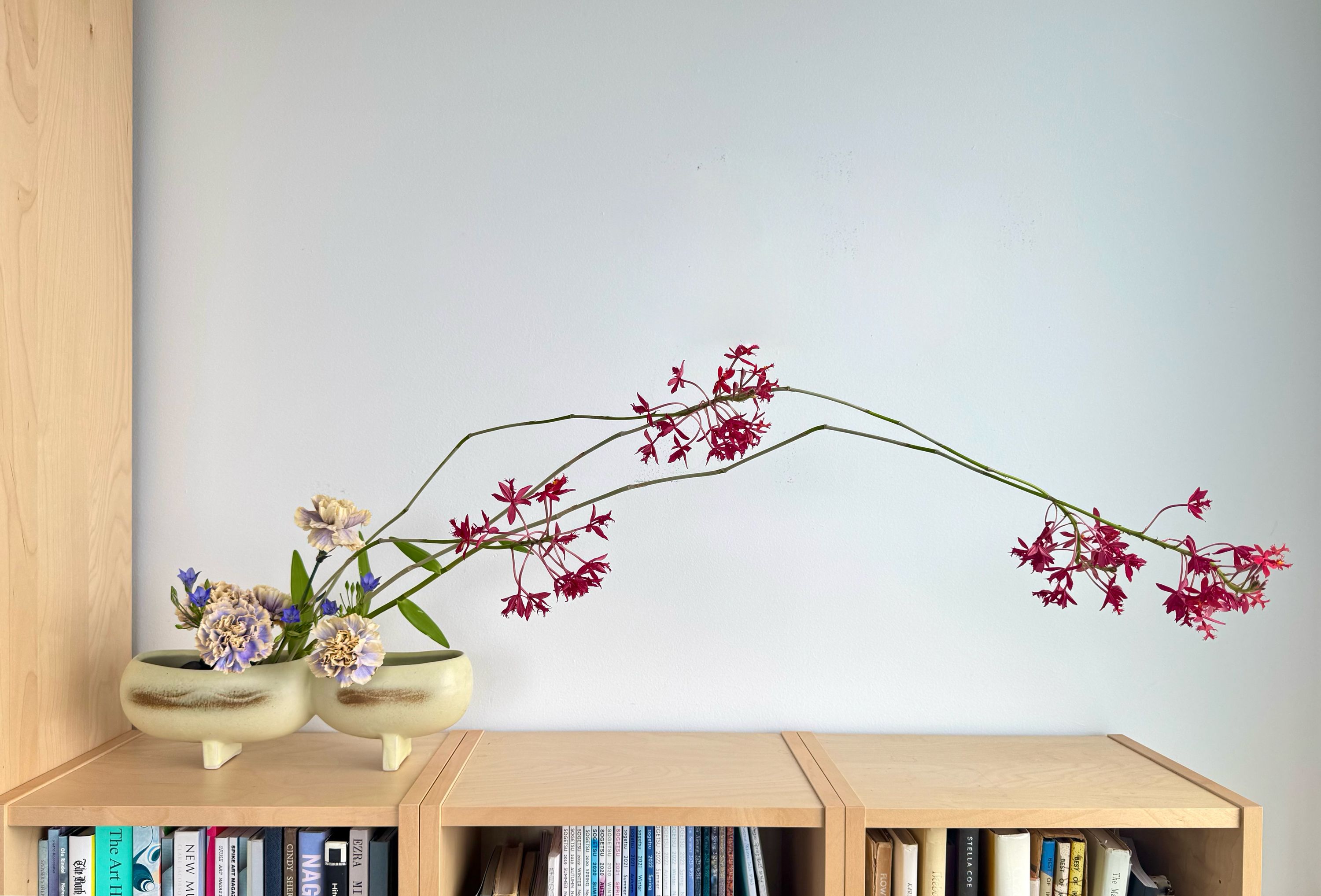
Recently I created a flower arrangement using this vase, and that also felt very Me, in a way. There is always a prompt I follow, as part of the Sogetsu Ikebana curriculum. This prompt was to utilize the space the arrangement would be placed in. While I was unable to choose the theme, the materials (and their color), positioning, and relationship to each other was indicative of my own sensibilities.
The carnations I selected were unlike any other I’ve seen before. I like to work with materials that are novel to me, just because I am drawn to the new, but it also opens up my repertoire of skills. The carnations tie in really well to the color of the vase. The yellow tips are nearly the same hue, and the blue provides almost a perfect complement (eg on the color wheel) to the yellow.
The orchids were really long (~4ft tall), which I felt could take up the majority of space on the shelf I placed the arrangement on. I also really liked the color, both on its own, but its contrast with the bright green stems.
The color palette of the arrangement is basically a primary palette, but slightly off. I have been thinking a lot about how color palettes described in theory could be garish, but altered by deft sensibilities, can create compelling combinations. Blue, yellow, red are literally the three primary colors. Incorporating the green of the stems is just combining blue and yellow together. Here we have a primary arrangement, with a secondary color as an accent.
I second guess a lot of things about myself, but my sense of color is not one of them, which feels really validating. One of my professors in school tried to kick me out my graphic design program because they thought I had no grasp on color, and it feels extra special to me that I think I have good color sense, despite what other people (who are allegedly more expert) have said to me. Additionally, I used to be really opposed to color in my life (as a lot of Designer-y Designers are), but as I get older I’ve completely changed course and have most of my life saturated in color, especially at home. I love that my appreciation of color will always develop for the rest of my life. I would like to try to bring that mindset to more things in life.